Themes
Overview
A theme in ciderpress is a brand identity with one or more variants. Each variant is a complete set of design tokens that targets either the dark or light aesthetic. ciderpress ships with six built-in themes — Mulled, Honeycrisp, Granny Smith, Amber, Midnight, and Arcade — and dark is the framework's baseline (the initial paint is always dark unless the user explicitly toggles to light on a multi-variant theme).
Built-in Themes
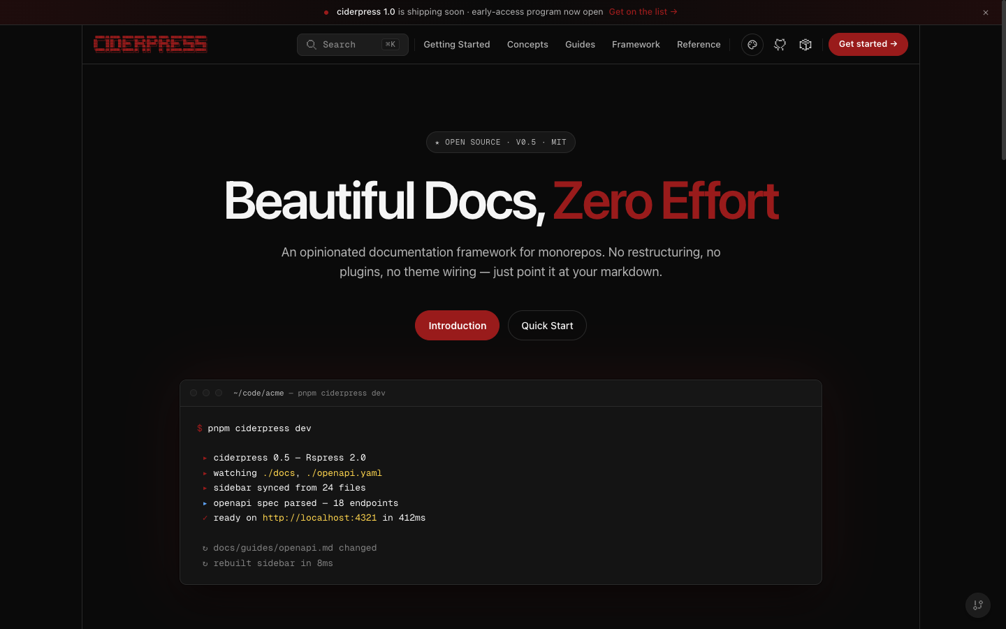
Mulled
The canonical brand. Deep cider burgundy — the "evening / premium" branch of the apple family. Primary #991b1b with both dark and light variants. The light variant pairs warm cream surfaces (#fbf6f4) with deep burgundy ink for a parchment read; the dark variant uses the same near-black canvas as the other apple themes. This is the default when theme.name is omitted. The legacy slug 'default' is preserved as an alias and resolves to 'mulled', so existing theme: { name: 'default' } configs continue to render the canonical palette without churn.
Variants: dark (default) · light
Honeycrisp
Bright apple-red identity (primary #dc2626) with both dark and light variants — the sun/moon toggle is enabled.
Variants: dark (default) · light

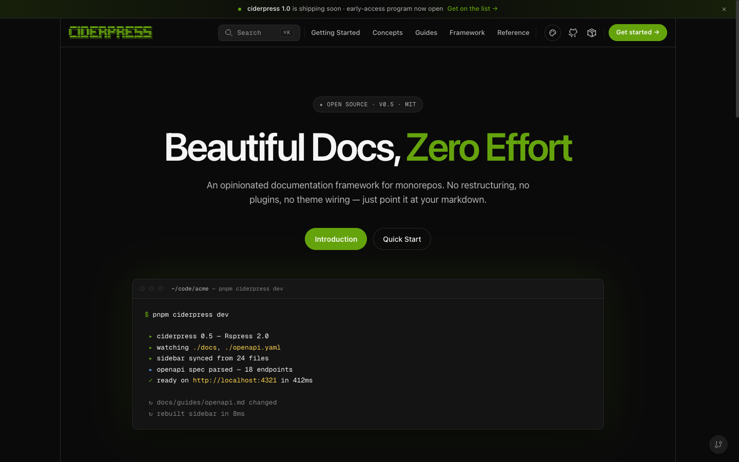
Granny Smith
Apple-green identity (primary #65a30d) with both dark and light variants — the sun/moon toggle is enabled.
Variants: dark (default) · light
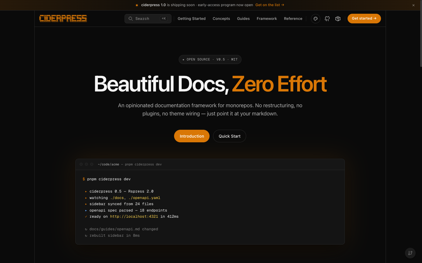
Amber
Warm hearth amber identity (primary #d97706) with both dark and light variants. The light variant pairs parchment surfaces (#fffaf2) with deep-roast brown ink; the dark variant shares the apple-family near-black canvas.
Variants: dark (default) · light
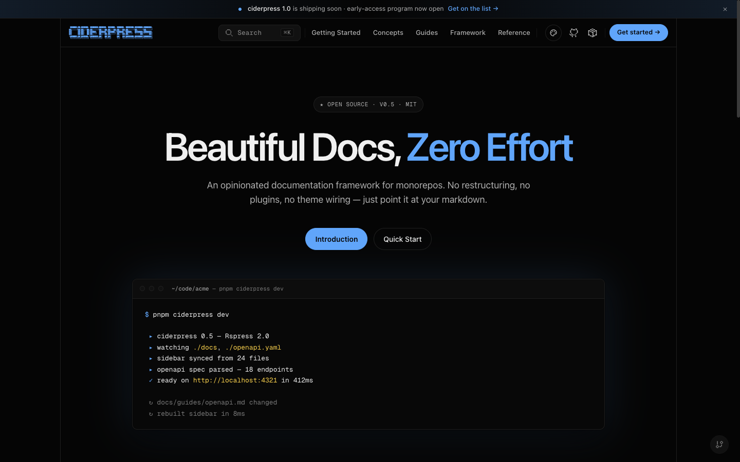
Midnight
Opinionated deep-black blue theme. Background sits at #050505 for a near-pure-black surface. Single-variant (dark only) — the sun/moon toggle is hidden when this theme is active.
Variants: dark
Arcade
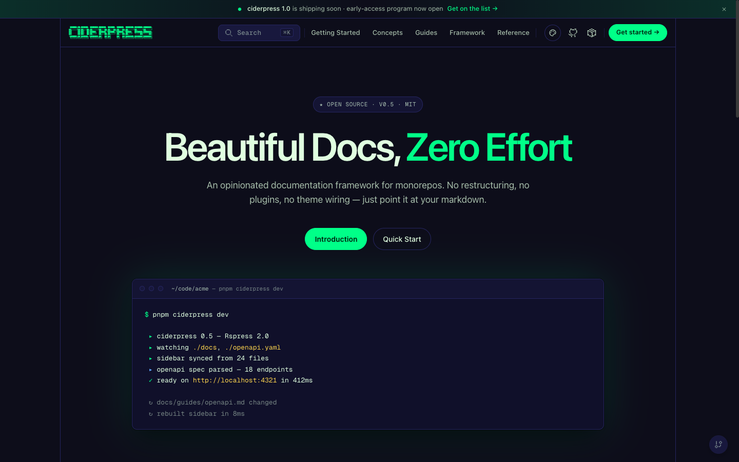
Retro neon-green theme inspired by arcade cabinets and CRT monitors. Single-variant (dark only). Includes custom hover animations: border tracing on cards, CRT scanlines on code blocks, neon pulse on buttons, glow effects on sidebar items.
Variants: dark
Configuration
Set the theme in your ciderpress.config.ts:
The name accepts any built-in theme (mulled, honeycrisp, grannysmith, amber, midnight, arcade) or any custom theme registered in the top-level themes array. The legacy slug 'default' is preserved as an alias for 'mulled'. An unknown name writes a build-time warning to stderr and falls back to mulled.
Options
Forcing a starting variant
Each theme picks its own initial variant when there's no persisted preference. You can override this from the config:
The user's last variant choice persists in localStorage and overrides this default on subsequent visits.
Hiding the toggle
Themes with only one variant (midnight, arcade) automatically hide the ☀️/🌙 toggle. CSS keys off data-cp-variants on <html> — the provider sets it from the active theme's variant list. No config needed.
Color Overrides
Override individual color tokens without creating a full custom theme. Overrides are applied as inline CSS custom properties and take precedence over the theme defaults.
colorsapplies to the light variant of the active theme.darkColorsapplies to the dark variant.
When the user toggles variants, the matching set kicks in.
Available color tokens
Color values must be valid CSS hex (#xxx or #xxxxxx) or rgba() values. The schema additionally rejects CSS terminators (;, {, }, </style>) to defend against injection in tenant-supplied themes.
Custom Themes
When the built-in themes plus color overrides aren't enough, register a fully custom theme through defineTheme. The theme is validated at config time and emitted as one html[data-cp-theme='{name}'][data-cp-variant='{variant}'] CSS block per variant.
Sharing tokens between variants
Token tree shapes are identical across variants. To share spacing/radii/fonts/etc. between dark and light, use object spread:
defineTheme validates each variant against the full token schema, so omitting a leaf surfaces a clear ZodError at config time.
Constraints
Comparing Approaches
Design Decisions
- Themes are brand identities; variants are dark/light. This separation matches Chakra UI's
_dark/_lightand shadcn/ui's.darkselector — a theme is a brand, and dark/light is a property of the site (not the theme). - Dark is the framework baseline.
defaultVariant: 'dark'on every built-in. Light is a real first-class option, but you have to opt in. - Single-variant themes hide the toggle. Midnight and Arcade are opinionated dark experiences — surfacing a light toggle would lie about what they ship.
- CSS custom properties. Overrides are injected as inline CSS variables, debuggable in browser devtools and compatible with any CSS-in-JS approach.
- Reduced motion support. The Arcade theme's animations respect
prefers-reduced-motion, disabling all continuous animations (border tracing, CRT scanlines, neon pulse, glow bar) automatically.
References
- Configuration reference —
themefield in the top-level config defineThemeAPI — full input shape (seepackages/theme/src/index.ts)